Clarity ON: Redhead Writing

ClarityOn

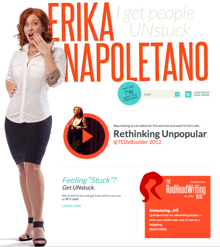
This morning, I came across the newly-relaunched website for Erika Napoletano, aka Redhead Writing.

Boom. Love at first sight.

Hmmm…let me backtrack a bit here. No, I don’t actually know Erika; and yes, I am profoundly in love with my wife (who is a brunette, by the way).

But when it comes to the branding/messaging – I was all-in within moments.

ErikaNapoletano

Bright simplicity of design. Superb use of colors and white space. Engaging picture. Clear navigation. And, above all, an exemplary message of clarity: I Get People UNstuck.

Attitude? Check. Compelling video? Check. Simple and memorable message? Check. Call to action? Check.

I got totally drawn in to the site. And I’ve been around the internet block for enough years to have pretty strong filters. Color me hard to impress.

While everyone else is arguing over who won the Super Bowl marketing wars on Sunday, I’m telling you right now who wins the Internet today. Erika Napoletano. No Clydesdales required.

Color me impressed.

(oh, and I stole the basic idea of the Clarity ON graphic above from Erika’s Twitter page. Which also rocks!)

Lowe’s to Home Depot: take 5. No, take 50!

Recently, a young couple we know and love were able to buy their first home. And, as all of you have “been there, done that” know, this involves beating a well-worn path to your neighborhood supply stores (especially, these days, Lowe’s or Home Depot) for the endless array of “stuff” you suddenly find out that you need as a homeowner.

So, as a housewarming gift, we thought it only appropriate to get a gift card. Since one of them had mentioned trips to Lowe’s, I figured that was the logical choice. And I was thrilled to see that you can just order the gift card on-line and have it sent for free – e-commerce is a beautiful thing.

Except at Lowe’s.

Four tries to simply order a $50 gift card. Four fails. Not only was the website slow and cumbersome, but when I’d try to complete the order, instead of just getting my info and completing the transaction, the site wanted my zip code so it could show me where the nearest stores were. It actively DID NOT ALLOW me to finish the purchase. A couple times, the site even froze.

That’s not e-commerce. It’s de-commerce!

So, with its brain-dead user interface, Lowe’s said to Home Depot: Take $50! And Home Depot was glad to oblige. No problem with their user experience.

When visiting the actual big box stores, my experience has been that Lowe’s seems cleaner and more nicely structured. But if you can’t replicate that on-line, then you’re going to lose customers to the competition. Would Lowe’s even think of putting a maze in front of the check-out counters in their store? Then why do that on-line? When people are ready to hand over their money, you’d better not put barriers in the way!

(UPDATE: here is documentation of the failure showing step-by-step screen flow [SlideShare file]. Oh, and Lowe’s?? I know this post seems quite negative, but I’m trying to help you here…my consulting time documenting your revenue loss is donated. You’re welcome!)

(UPDATE 2: This post did stir up some attention at Lowe’s. I actually got a call from someone well-placed in the Lowes.com environment, who spoke to me about the problem with real candor, and shared about  upcoming changes to the site. Does social media work? Yes it does!)

(image credit)

Zemanta Pixie